Usage
The home page consists of three main sections:
- Dunkelflauten Search
- Search and Highlight
- Add Occurrences & Duration Trendlines
- Select Timeseries Filter Data
- Select Timeseries Resolution
- Smooth Timeseries Data using Centered Moving Average
- Dunkelflauten Cost
- Select Table of Maximum Renewable Share
- Select Columns
- Dunkelflauten Weather
- Wind & Cloudiness
- Pressure Regions
1) Dunkelflauten Search
The first section of the site is about finding dark doldrums, herein called Dunkelflauten.
Typically, a Dunkelflaute is defined as a certain minimum timeperiod in which the share of renewables does not succeed a certain limit.
You can specify both in the top section.
First, the Maximum Share of Renewables refers to Solar, Wind, Hydro, Biomass and other renewable power production methods.
The exact definition comes from the data provider SMARD: Strommarktdaten Deutschland.
Type in a value in between 0 and 100. Although both exact values make no sense, you can still experiment with all.
Second, type in the days of the minimum duration.
You can also type in the minimum number of hours and then select in the drop down on the right "Hour" to interpret your input correctly.
Note, that inputting 2 and selecting "Day" leads to different results than entering 48 and selecting "Hour".
This is because of the different search space:
The search looks for a consecutive series where the max share of renewable requirement is fulfilled.
SMARD offers quarterhour, hour, day, week and year as data resolutions.
All except the first resolutions are averages of the finer resolutions during the longer period.
Therefore, "Hour" is more volatile than "Day" which is more fidgety than "Week".
That means, the resolution "Hour" will find the least and "Week" the most occurrences even if you fill in the same time period.
Example:
Max Share: 30%
1 Week => 22 matches,
7 Days => 12 matches,
168 Hours => 4 periods found.
Because a couple of hours of high renewable output would not be enough for lignite power plants to shut down,
we use resolution "Day" most of the time, if not specified otherwise.
1.1 Search and Highlight
If you have typed in valid values, you can see light red vertical plot bands showing up in the graph
after clicking on the button with the label "Search and Highlight".
Make sure you have not too much contrast on your screen to see them.
Note that you may not see any bar depending on your criteria.
It may also be the case that the search result is not in the data focus you are currently seeing.
In that case, you might want to scroll and drag on the graph to readjust your view.
You can also use the smaller viewfinder bar below the main graph to find your time of interest.
It might also be needed to reset the resolution to "Day" to get the results in the view.
1.2 Search and Add Occurrences/Duration Trendlines
You can also select the button labeled "Search and Add Occurrences/Duration Trendlines". This will introduce two new lines into the graph. They show the sum of the Dunkelflauten occurrences and duration from the last year up to this date respectively. Occurrences are called events to shorten the legend. The reason for that is that only showing the occurrences might be misleading. This is because, depending on the definition, you have fewer but longer occurrences earlier in the time of the graph. Without showing the duration, one could think that the rising share of renewables would lead to more Dunkelflauten, when in fact more occurrences are correct but their summed duration means they happen more rarely:
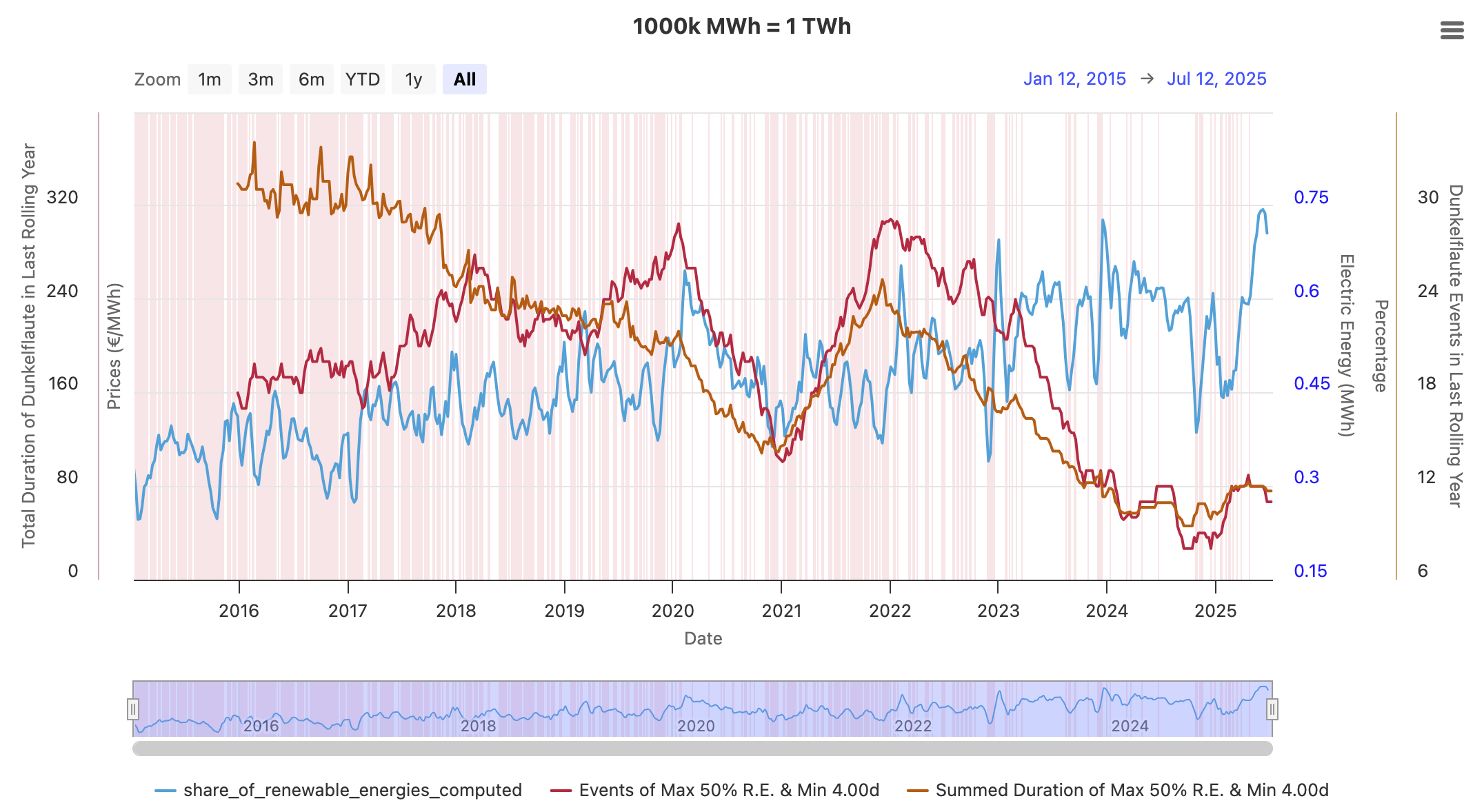
As you can see, the summed duration of Dunkelflauten is in total decreasing, while the occurrences peak at the beginning of 2020 and the start of 2022.
1.3 Select Timeseries Filter Data
When opening the website, three timeseries get loaded in the chart as a preview.
In the selector field below the chart, you can select the timeseries you actually want to see.
All options except those from the first category "Virtual Computed Timeseries" originate from SMARD.
1000k MWh = 1 TWh is there to give context to the y-axis.
Timeseries in the "Electric Energy in MWh" category might be difficult to grasp for large values.
The exact values also depend on the selected resolution.
To get the electric power instead of the electric energy, it is the easiest to select the "Hour" resolution
because the nominal values will then stay the same as they are divided by 1h.
Wind and Solar, make up most of the renewable electricity production,
but renewable electricity also includes biomass 9%, hydropower 5% and other kinds like geothermal energy 1%.
Therefore, they are about 15% higher than just Wind and PV, also known as Variable Renewable Energies (VRE).
You can see this varying relation by selecting both "Share of Renewable Energies Computed"
and "Share of Photovoltaic Wind Onshore Offshore Computed".
You can see all calculations of the computed time series below.
Because I have not checked yet, if the electricity import is correctly calculated at all times and
how the pumped storage is accounted for, I do not advise using this timeseries (it is also not really a focus).
            1- ((t.power_consumption_residual_load) / t.power_consumption_total)
            AS share_of_photovoltaic_wind_onshore_offshore_computed

            1- ((t.power_consumption_residual_load - t.electricity_production_hydropower - t.electricity_production_other_renewables
             - t.electricity_production_biomass - t.electricity_production_pumped_storage )
             / t.power_consumption_total)
            AS share_of_renewable_energies_computed,

            (  -- add up all available production sources
                electricity_production_lignite
                + electricity_production_nuclear_energy
                + electricity_production_wind_offshore
                + electricity_production_hydropower
                + electricity_production_other_conventional
                + electricity_production_other_renewables
                + electricity_production_biomass
                + electricity_production_wind_onshore
                + electricity_production_photovoltaics
                + electricity_production_hard_coal
                + electricity_production_pumped_storage
                + electricity_production_natural_gas
            ) AS total_production

            (t.power_consumption_total - t.total_production) AS import_to_fix,
1.4 Select Timeseries Resolution
If you have zoomed in the graph enough, you are able to increase the data resolution to hour and even quarterhour.
Because there is a lot of data when looking at the timeseries from the beginning of 2015,
it is only possible to get these two kinds of high resolutions for chartDurationDays <= 365*2.
1.5 Smooth Timeseries Data using Centered Moving Average
Sometimes, the selected timeseries is very volatile.
To better see the general trend, one can select the timeseries to adjust and the period for the moving window.
Then, with a click on "Recalculate", the algorithm traverses over the series and sets the new averaged values
for the time series. Therefore, the timeseries shrinks in length.
To reset, just move the slider to 1 and click the button again.
2) Dunkelflauten Cost
This section just focuses on the individual Dunkelflauten, much like an object-oriented approach. Thereby, we can compare their characteristics like duration, year of occurrence, and their price increase, to just name a few.
2.1 Select Table of Maximum Renewable Share
Instead of having a free to choose maximum of renewables, we can only select certain thresholds here,
because the construction of this enriched Dunkelflauten data takes a lot of time.
Because of integration over energy and price variables, quarterhour resolution was selected for maximum accuracy.
Therefore, only less Dunkelflauten than in the Search section above are displayed.
More tables are planned in the future.
One might introduce tables with different resolutions in the future.
Also, Dunkelflauten before the 1st of October 2018 GMT+2 are not displayed because no pricing information is
provided by the data provider then and the main aim is to calculate values based on prices.
2.2 Select Columns
Unfortunately, the Bubble Coloring depending on a data column does not work so far.
However, this functionality could, for example, be used to detect a relationship between the mean temperature
in Germany and the price increase, also known as "kalte Dunkelflauten".
The rationale behind presenting a multitude of potential columns is to empower the user to trace
the calculations and facilitate exploratory endeavors.
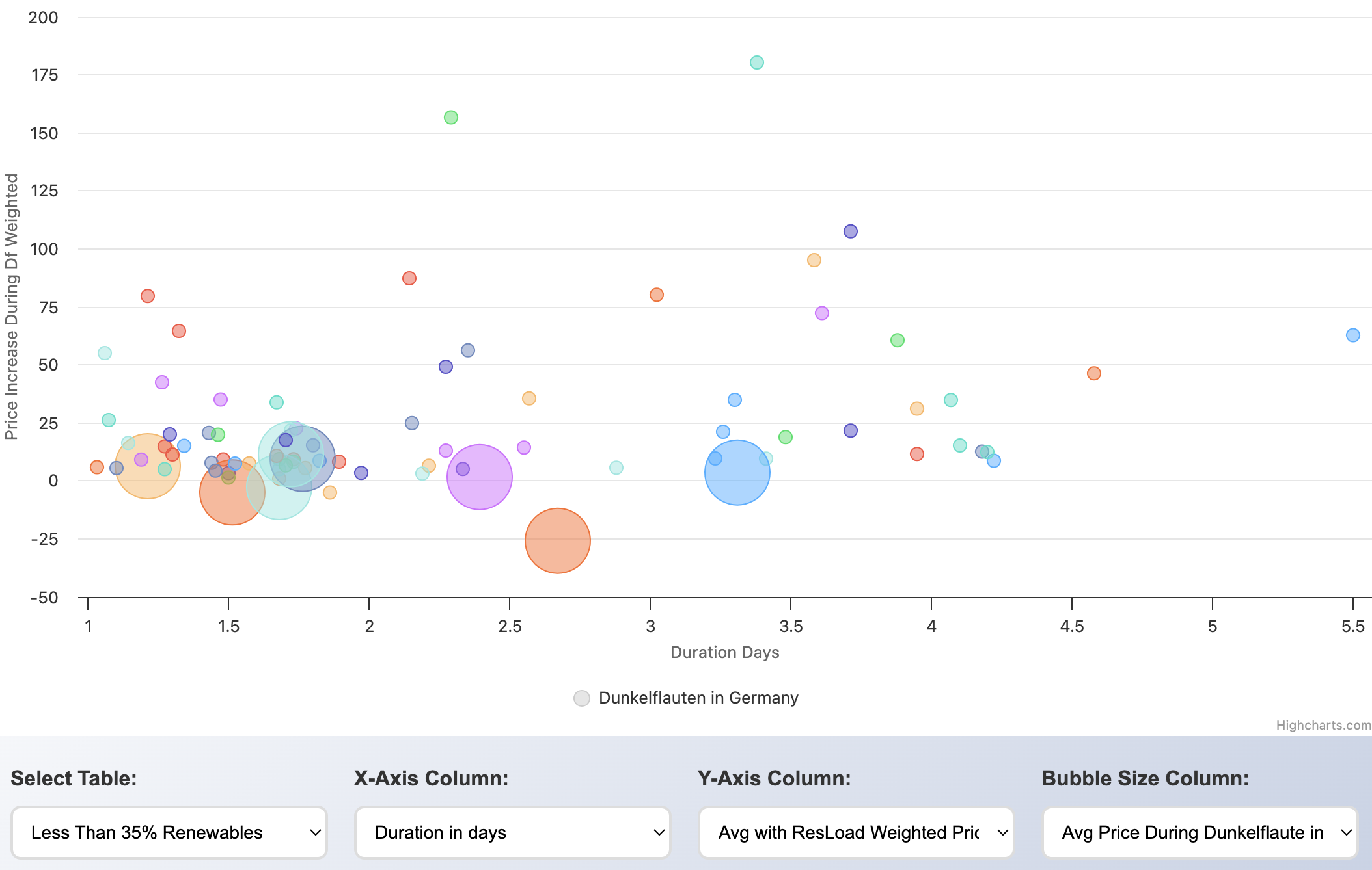
In this setup, one can, for example, see that there are also instances in which the weighted price actually fell
during a Dunkelflaute. However, because we selected
"Avg Price During Dunkelflaute in Range of Price Before and After"
as the size of the bubbles, we can see that most times,
this lower price is just regarding the average of the price before and the price after
and is not in regard to being lower than both before and after prices.
If we look at durations greater than 2 days, this is always the case.
There is, however, one incidence with a duration of 1.86 days
when the average price during the Dunkelflaute was lower than both:
1) the with the residual load weighted price of the 7-day time span before this Dunkelflaute and
2) the with the residual load weighted price of the 7-day time span after this Dunkelflaute.
On hovering over this dot, we can see when it started and how long it lasted.
We can then go back to the first section for a closer analysis:
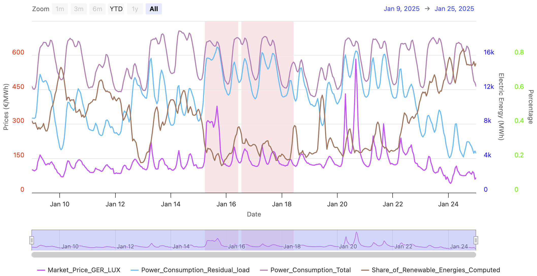
By clicking "Search and Highlight" for max 35% and min 24 hours, we get the exact timing:
(2025/01/16, 1:30pm) 1.86 days until (2025/01/18, 10am)
7 days before the start was the 9th of January, 7 days after was the 25th of January.
One can see that right before was actually another quite short Dunkelflaute from the 15th of Jan to the 16th of Jan.
After the weekend 18th/19th January, the total power consumption rose again.
There, the price peaks again on Monday but is only at a fraction of the cost on Tuesday even though
the residual load is at comparable levels.
That being said, one can safely say that the Dunkelflauten cannot lead to low prices,
only to relatively lower prices than the price peaks surrounding the DF.
By also looking at other instances, one can typically not see a rising price because energy storage
could get empty but rather a decreasing price over the Dunkelflauten period, probably indicating
startup costs of fossil fuel power plants. The conclusion might be that the most expensive part is
not running the conventional power plants but turning them off and on, comparable to a high momentum system.
3) Dunkelflauten Weather
The last section is an embedded weather map from Ventusky.
Its advantage over windfinder.com, windy.com and windy.app is that there is active support for this kind
of website widget where a datepicker is included to easily look up the weather of historic Dunkelflauten.
3.1 Wind and Cloudiness
Unfortunately, wind speeds other than at 10 meters height are only available on the main Ventusky site
and not in the embed.
Clicking on the marker in the middle of the map or on the logo on the top right will lead you there to see
the other heights in which wind power plants actually capture the wind energy.
However, in most regions, the wind speeds in different heights up to about 500 meters are directly proportional
to each other.
Cloud maps can also be enabled by first clicking on the top left orange button and then selecting "Clouds".
For the previously mentioned quite short Dunkelflaute on the 15th of January 2025, we can see strong doldrums
and a lot of clouds, compared to the next day, the 16th of January, visible on the two right pictures:
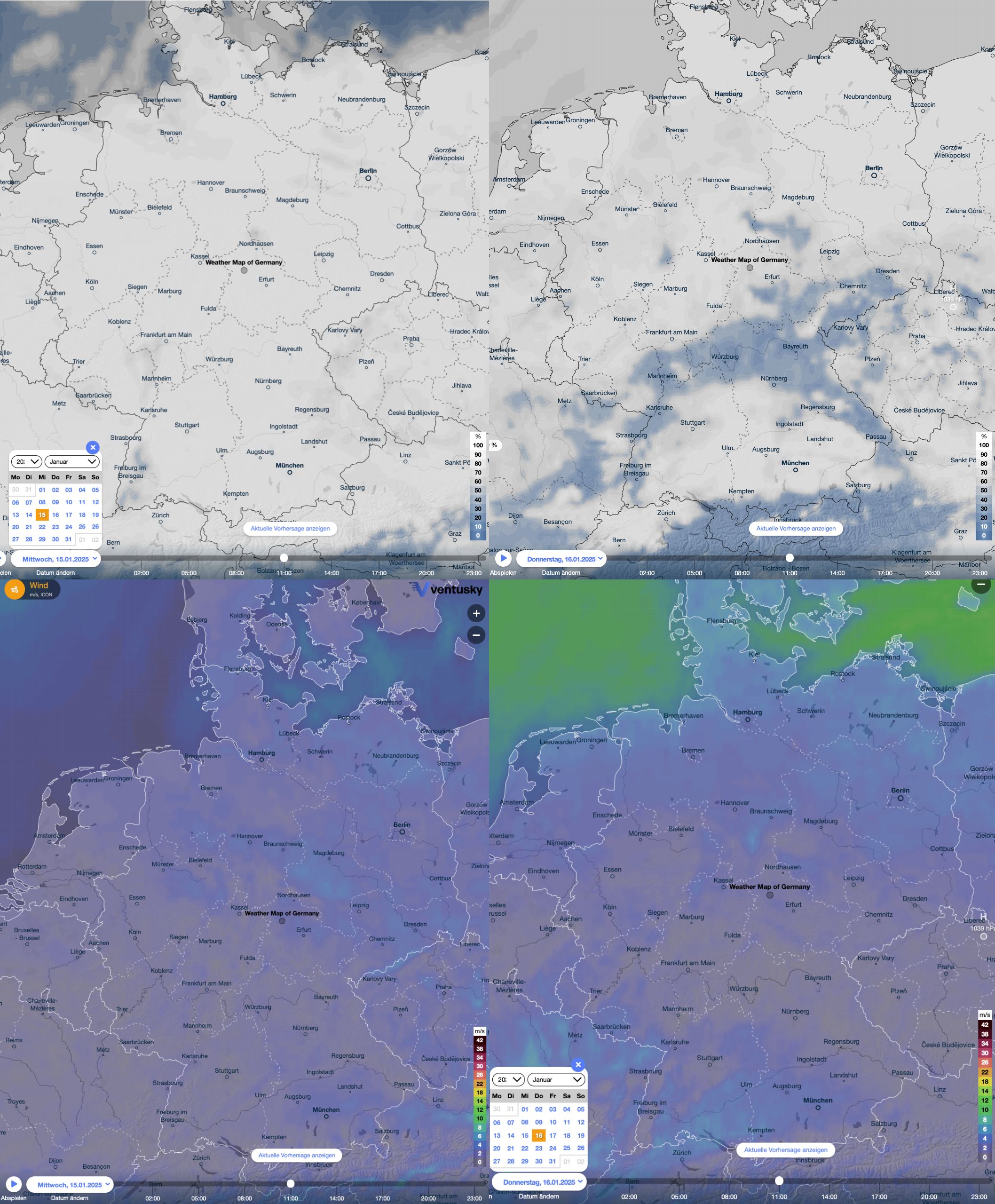
By looking at a different set of timeseries on the chart in the first section, we can see how this weather contributed to such low renewable shares:
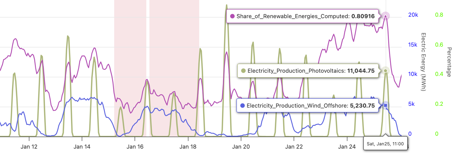
The central to south regions were able to get some sunlight, and the offshore wind was pretty strong.
Thereby, the 16th had a higher share of renewables than the 15th.
3.2 Pressure Regions
One can also click on the play button of the embedded map and see how the weather evolves.
This is especially interesting regarding the weather regimes that are very often mentioned in the context
of Dunkelflauten.
Unfortunately, one can mainly see an implication, that is, if there is a Dunkelflaute, there is usually also
a high pressure system across Germany.
The other way around, High Pressure => Dunkelflaute, does not
hold as one can see on the following days of the 12th of January 2025.